UI Redesign
Converting Non-Digital Natives through Effective Redesign
Navigation overhaul for a mobile hiking app
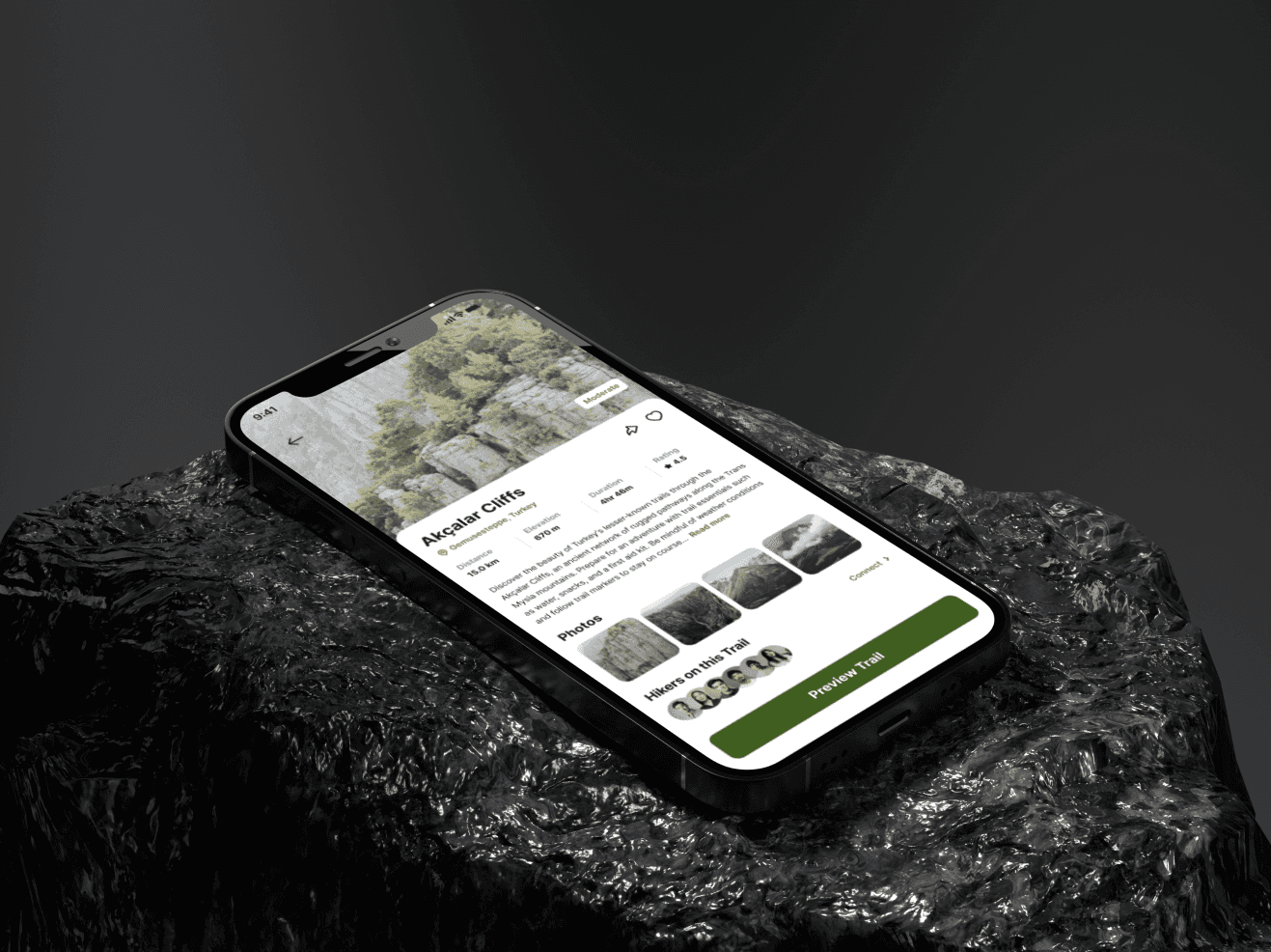
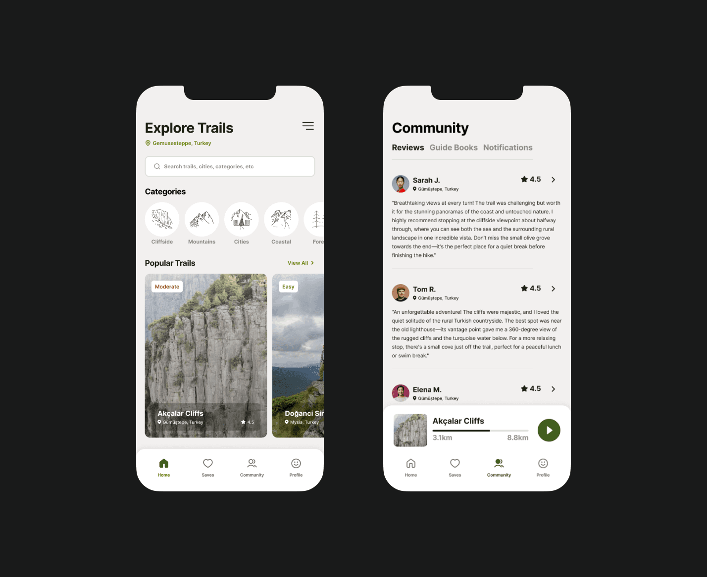
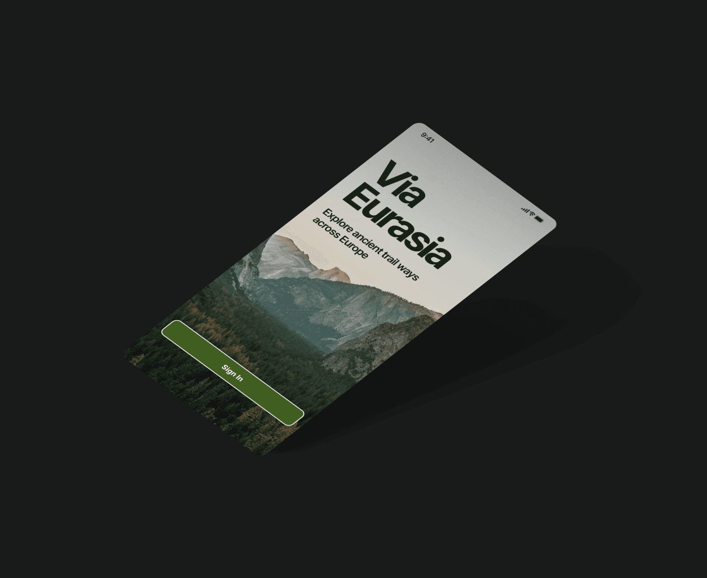
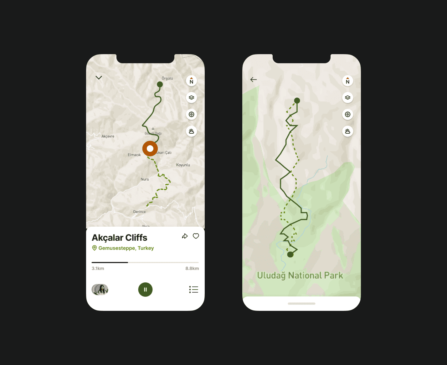
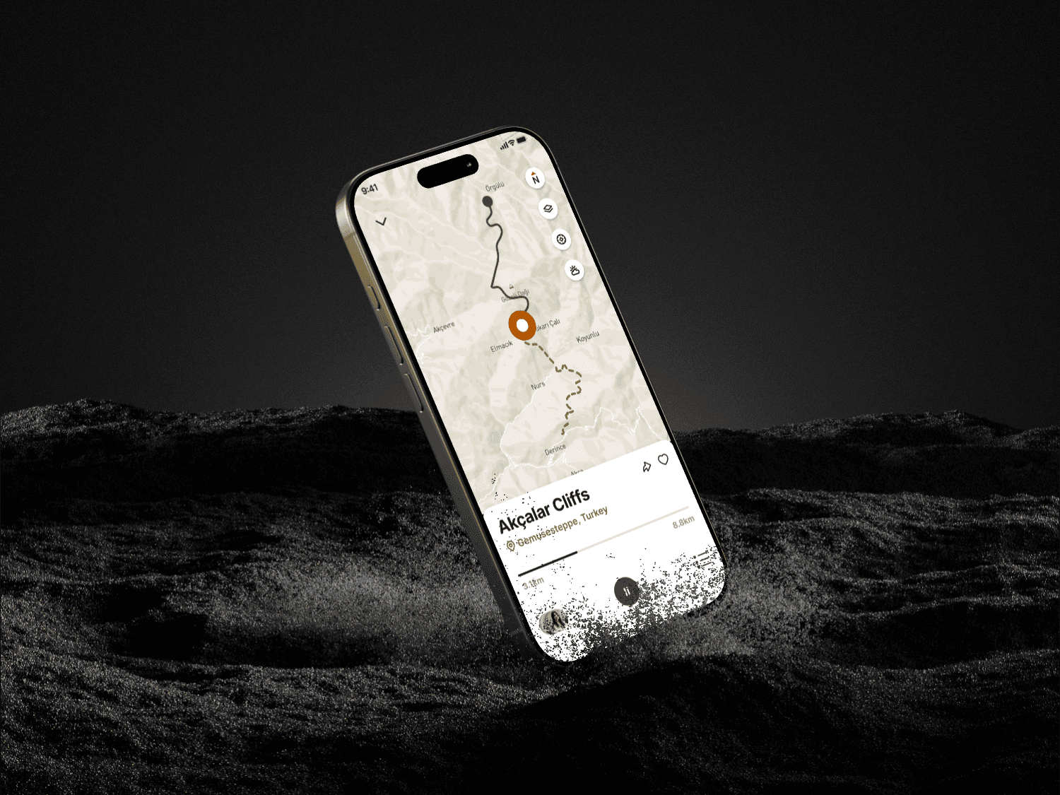
A mobile trekking app with a high bounce rate was losing users due to poor navigation. Customers were having difficulty selecting a route and using the map to follow a hike. By identifying UX issues through a complete heuristic evaluation, I redesigned the navigation structure to gain and retain new customers, improving accessibility and user flow for their audience, made up of 90% non-digital natives. The results were increased online sales, happier customers, and fewer support requests.
RESEARCH
How is designing for non-digital natives different?
People who grew up without smart phones, or who otherwise have little familiarity with digital products, need simple navigation and clear visual indicators. Our app's success would largely rely on it being actually easier than using a physical map.
DISCOVERY
The team and I worked through potential problem areas while reviewing the current user journey.
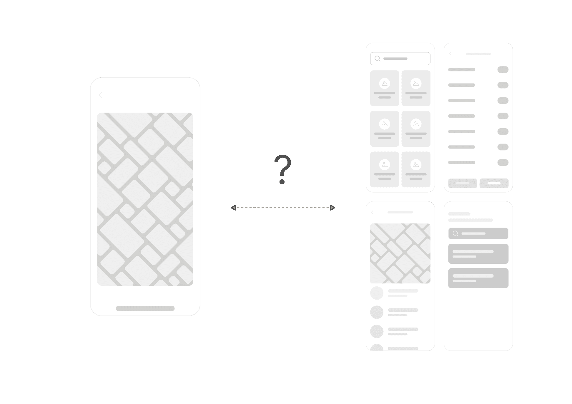
We were unsure how to offer constant access to a live route while moving through other tabs or whether it was even necessary, so first we tested the flow as a standalone journey that had to be manually ended to return to the main screen.
Jobs to be Done:
Reduce number of screens to complete a map/route user flow
Create a user experience free from navigation restrictions
Improve accessibility for non-digital natives
CHALLENGE
The main issue was that users couldn't use other parts of the app while on an active map route.
56% of users reported struggling to navigate or perform other tasks while on an active route, including:
Weather
Reviews
Community notifications/alerts
Local highlights
SOLUTION
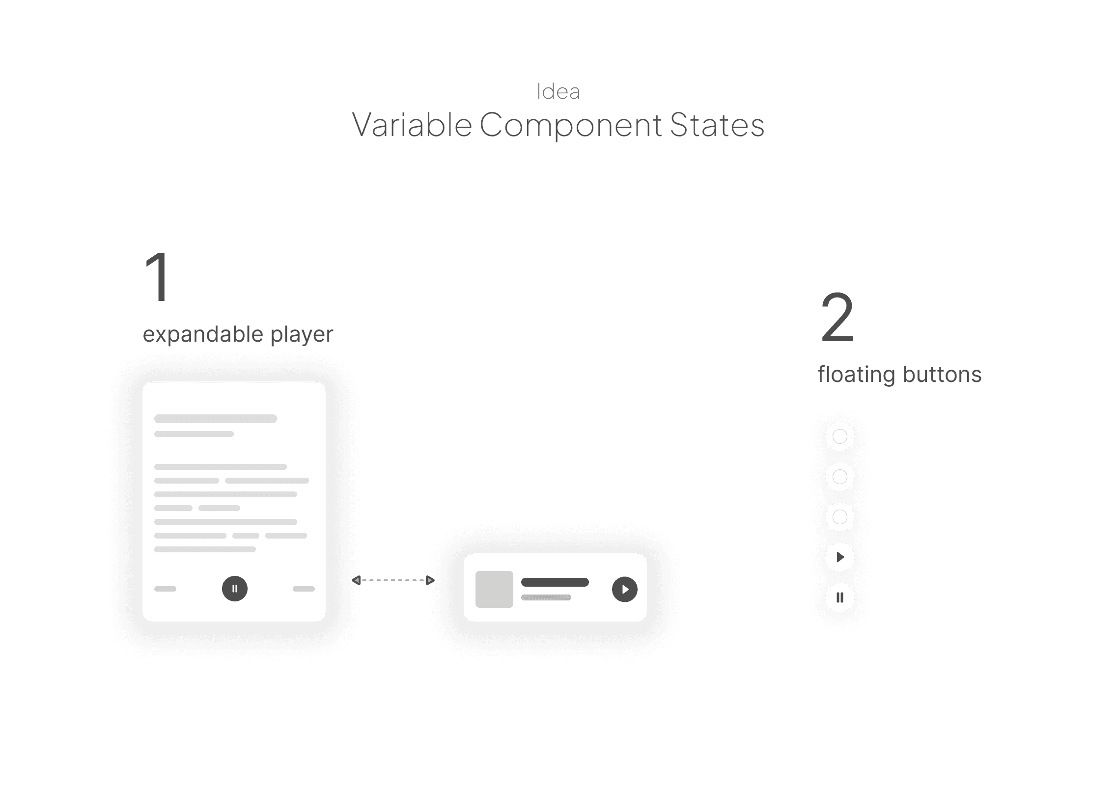
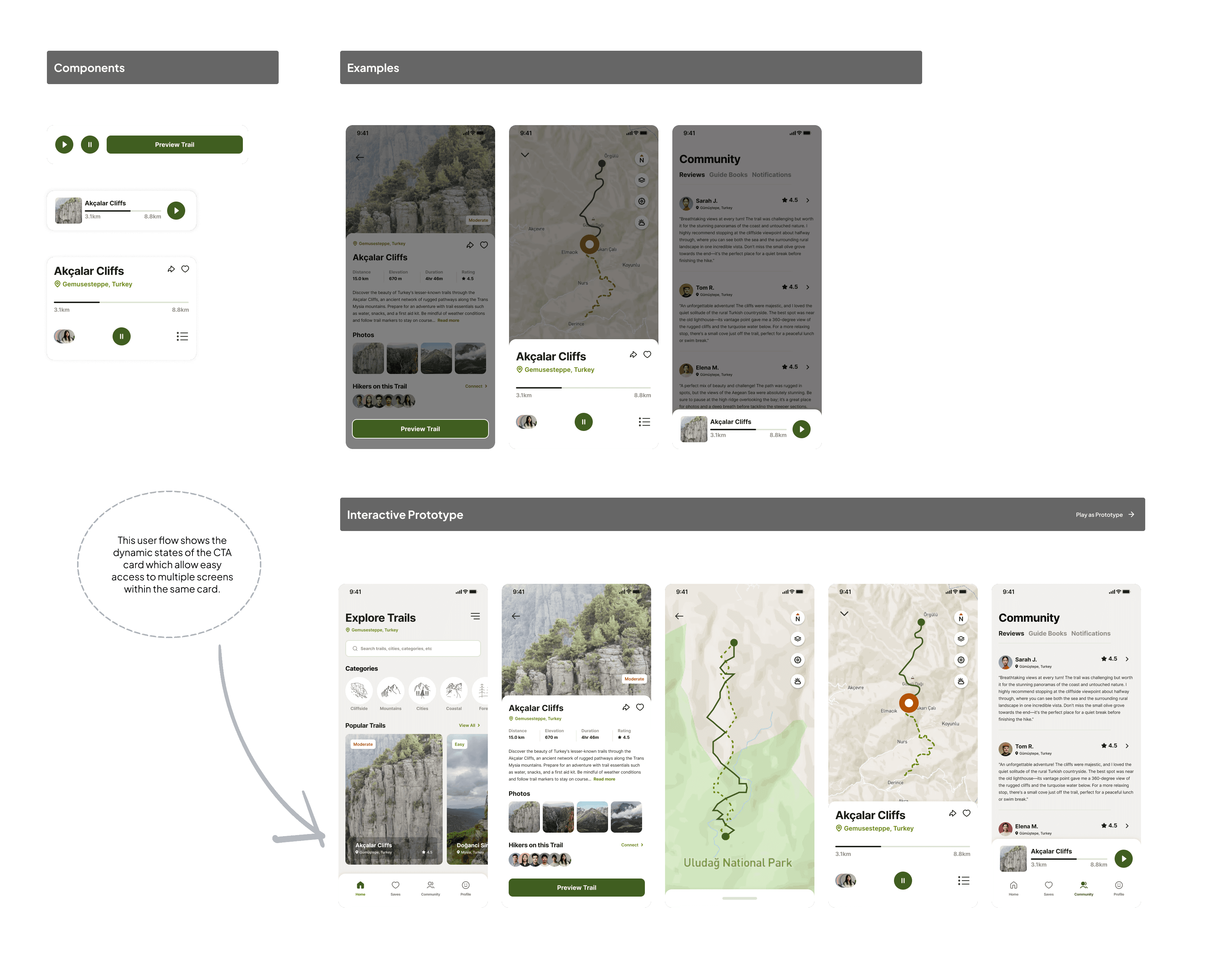
I reduced screen quantity and improved usability by creating a variable component state that allowed dynamic screen interactions.
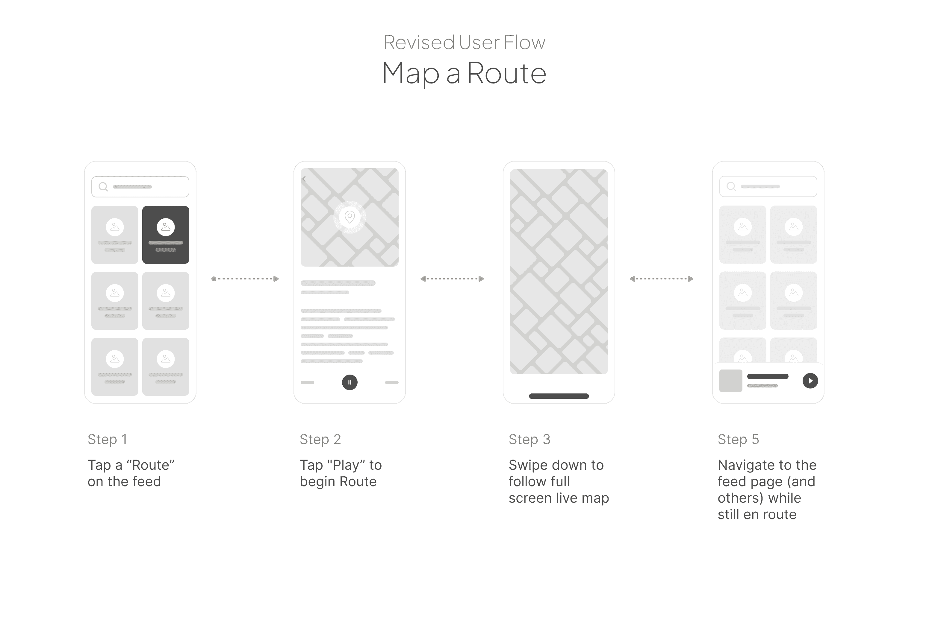
After several iterations, I introduced a similar pattern to a music app, where the CTA remains as a sticky playback button which is accessible from any screen as long as the route is in progress. By changing the End Route button to a Pause/Play button, and add a swipe feature minimises the frame into a CTA at the bottom of the screen.
With the revised patterns, I used stakeholder feedback to design secondary and tertiary screens to complete the journey.
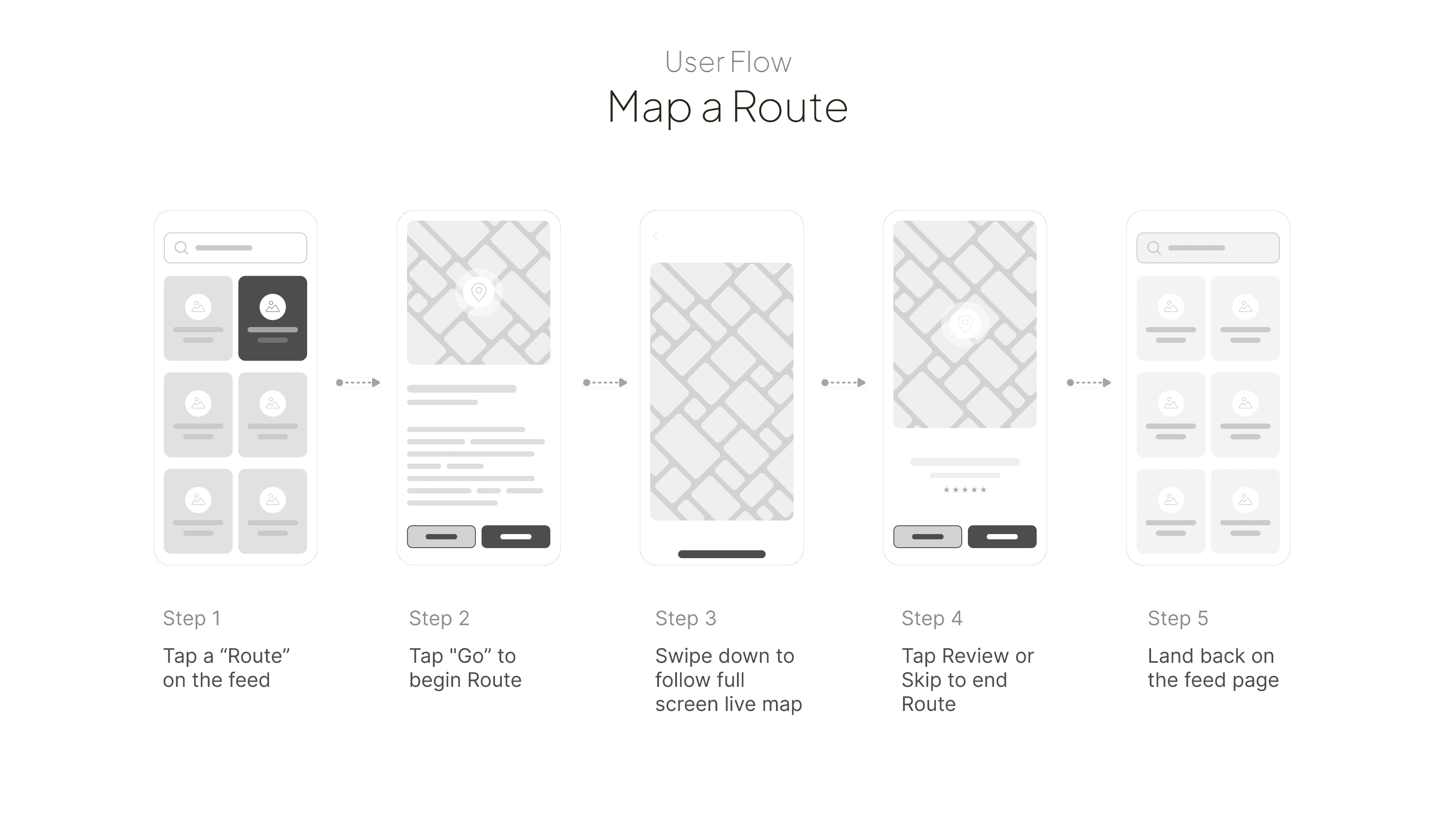
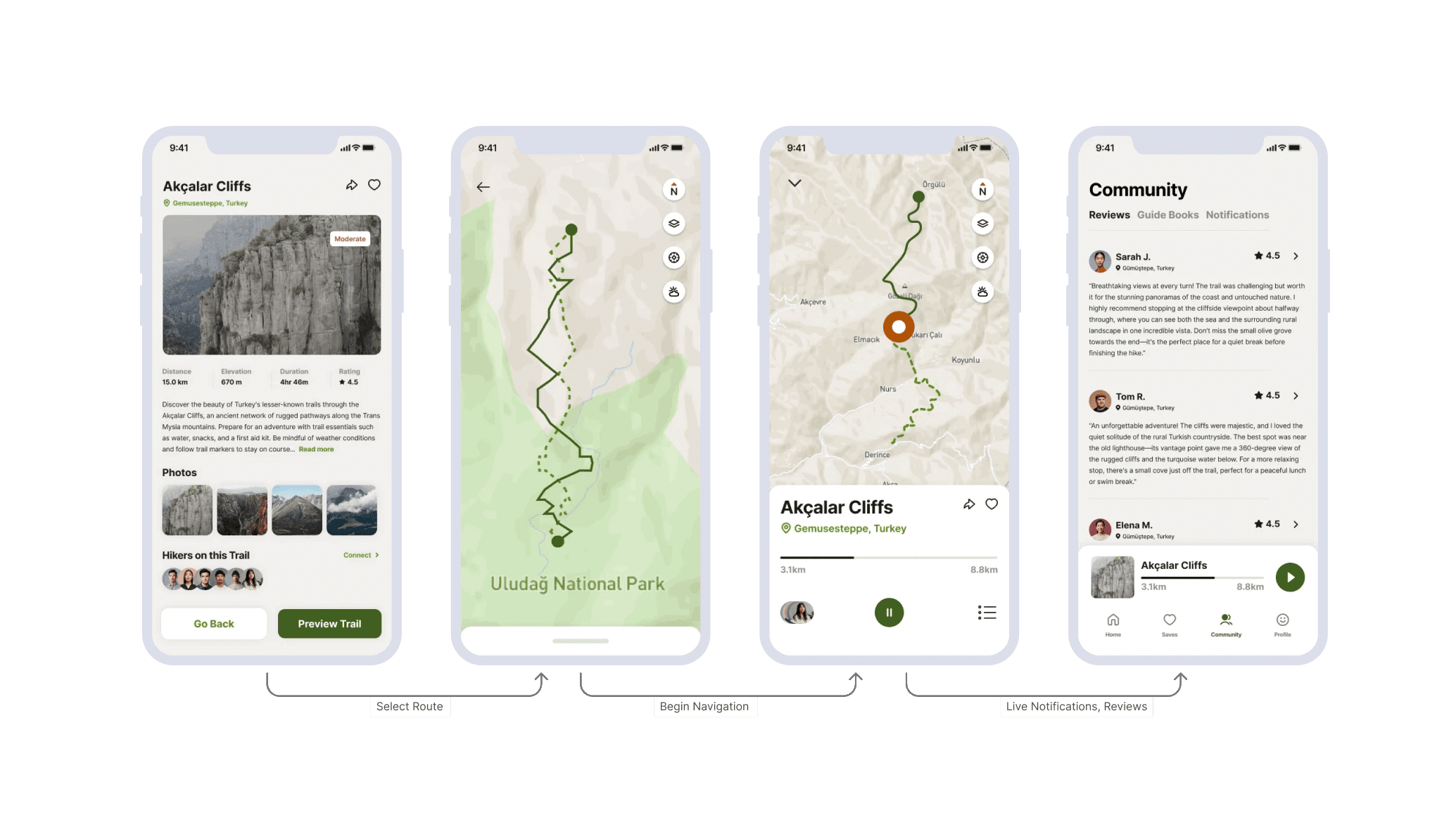
In order to make choosing and mapping a route as concise as possible, I kept the flow to four screens or less. I made sure each screen served its function to the best of its ability, using CTAs on a bottom navigation component, and a swipe map feature to flow easily between screens.
OUTCOMES
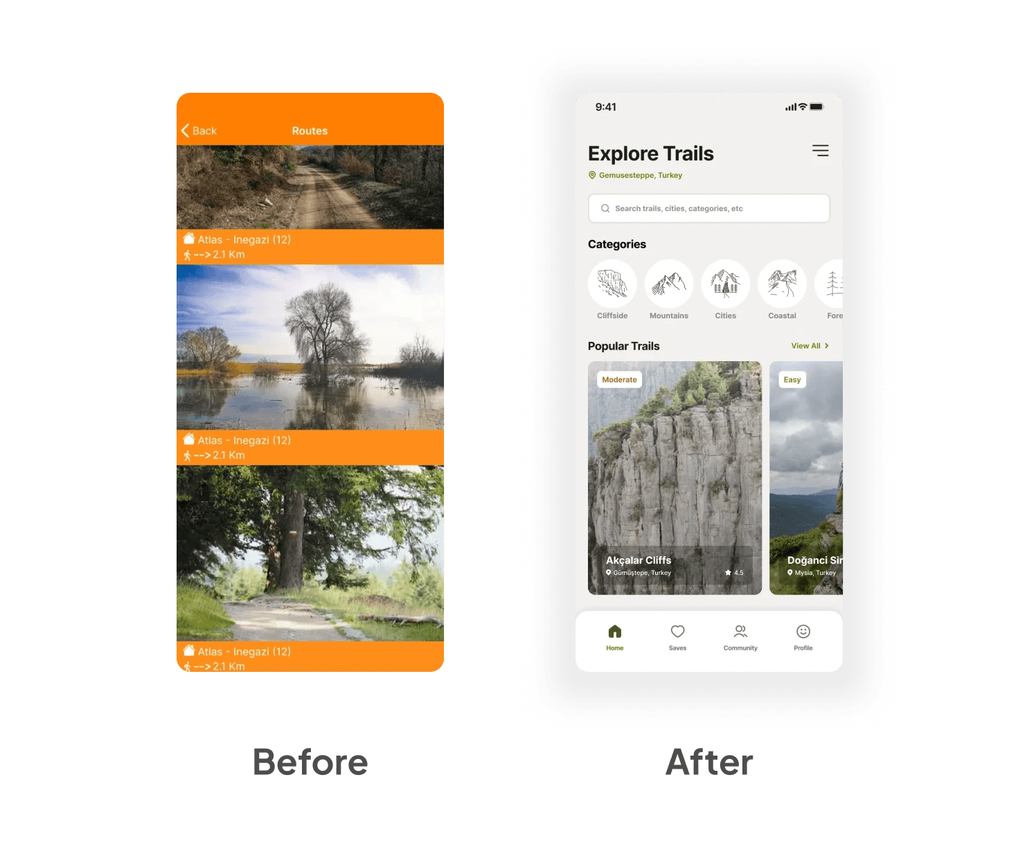
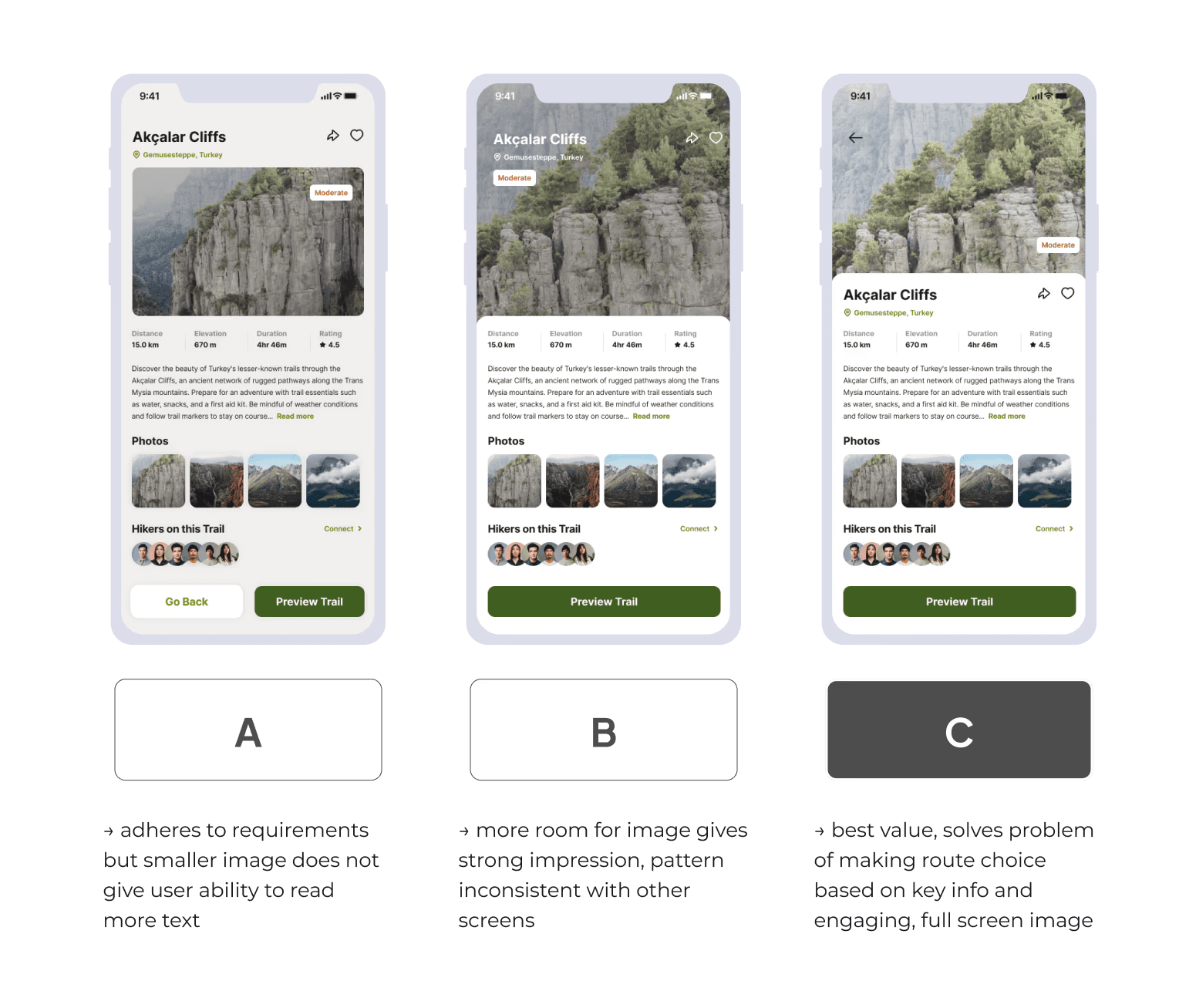
Confirming the redesign through A/B testing improved the route selection screen.
Testing confirmed the new flow significantly improved ease of navigation. Following the same methods, I continued redesigning with the updated layout, assets and colours. New wireframes improved the user's ability to find, select and map a hiking route, locating points of interest along the way.
DESIGN SYSTEM
I made sure the team understood all aspects of design implementation and use cases, to avoid misunderstandings at handoff.
I mapped out the building blocks of my design system, from atom components to molecules, and larger, complex organisms that housed several interactions. Effective communication ensured everyone was on the same page, understood the functionality of my designs, and how the interactions worked in real time.
Impacts
This project encouraged eco-tourism through cultural exchange & environmental awareness of an historic trail network. From redefining the way hikes are planned, to guiding an end-to-end redesign of the core journey, I reviewed and improved every part of the user flow, surpassing the team's expectations. Further improvements could be made and new features like live weather could be added to the user experience with more testing for use cases, if a budget constraints were no issue.
