Product Design
Improving Purchase Satisfaction with Enhanced Filters
Data-driven feature update for a responsive e-commerce platform
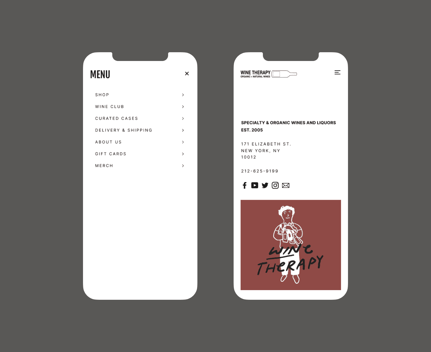
Online sales were performing much lower than expected. Customers were frustrated finding and choosing the right wine on the website. I designed a feature to increase online sales by improving the wine selection experience. The results were a significant increase in sales, happier customers, and fewer support requests.
SCOPE
Analysing quantitative data on user interactions to locate pain points.
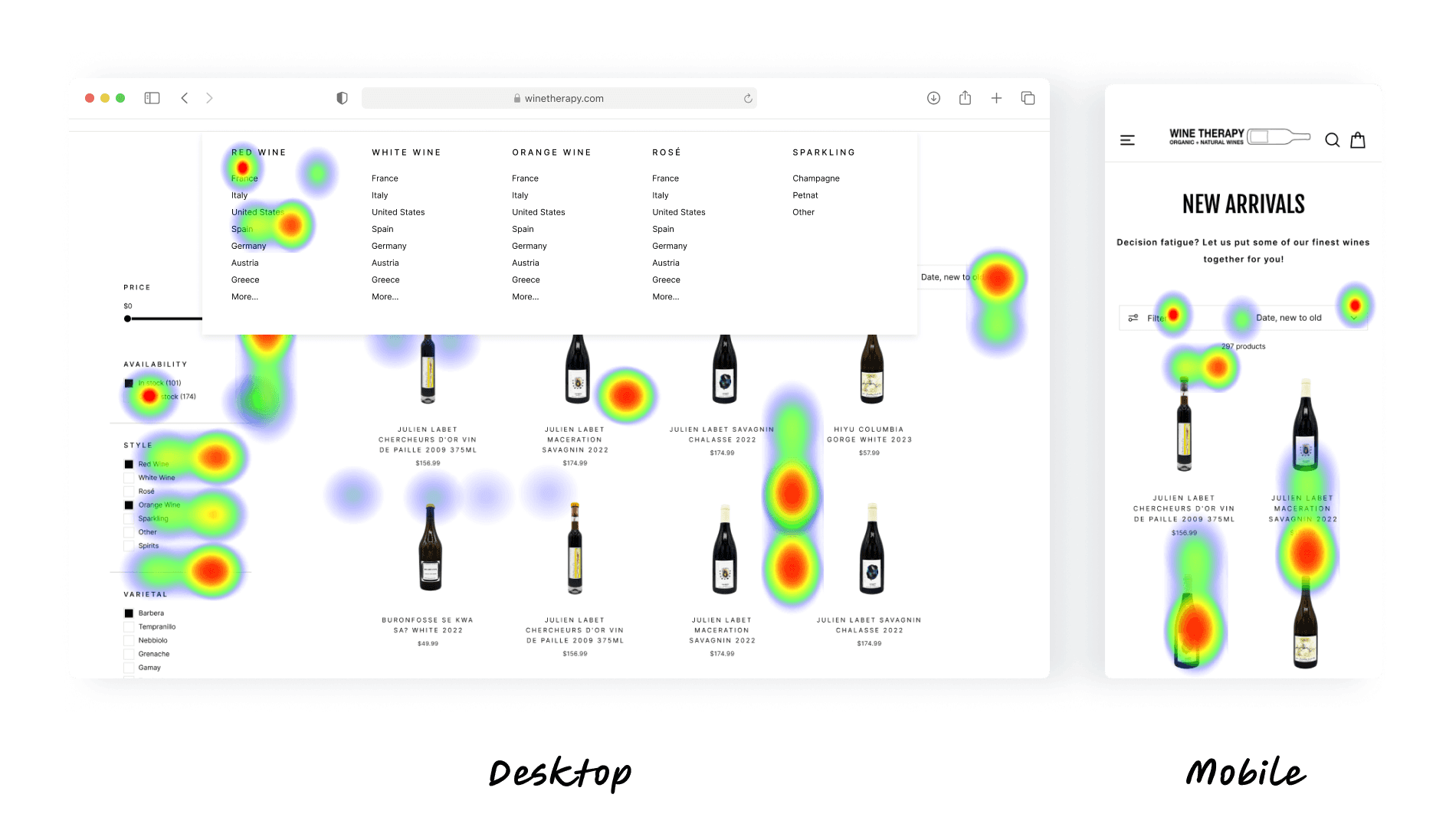
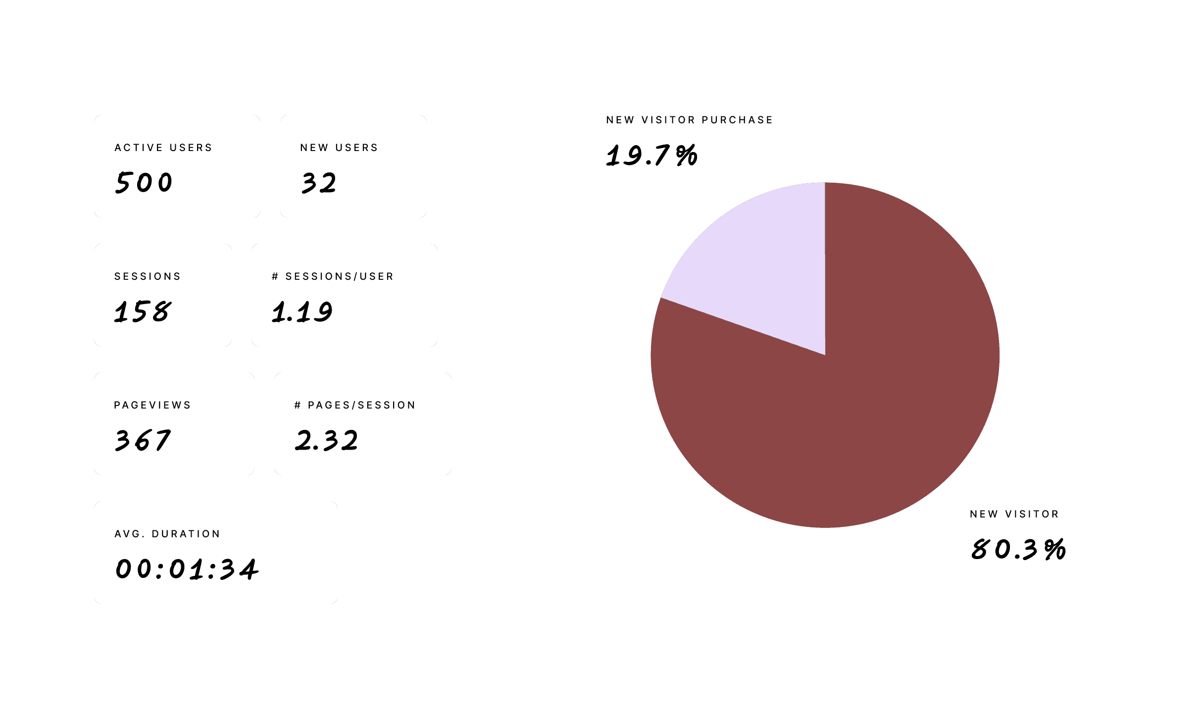
Using heat map testing and Google Analytics data collection for the site, I conducted a thorough review of how users interacted with the current filters and navigated from the homepage to product selection.
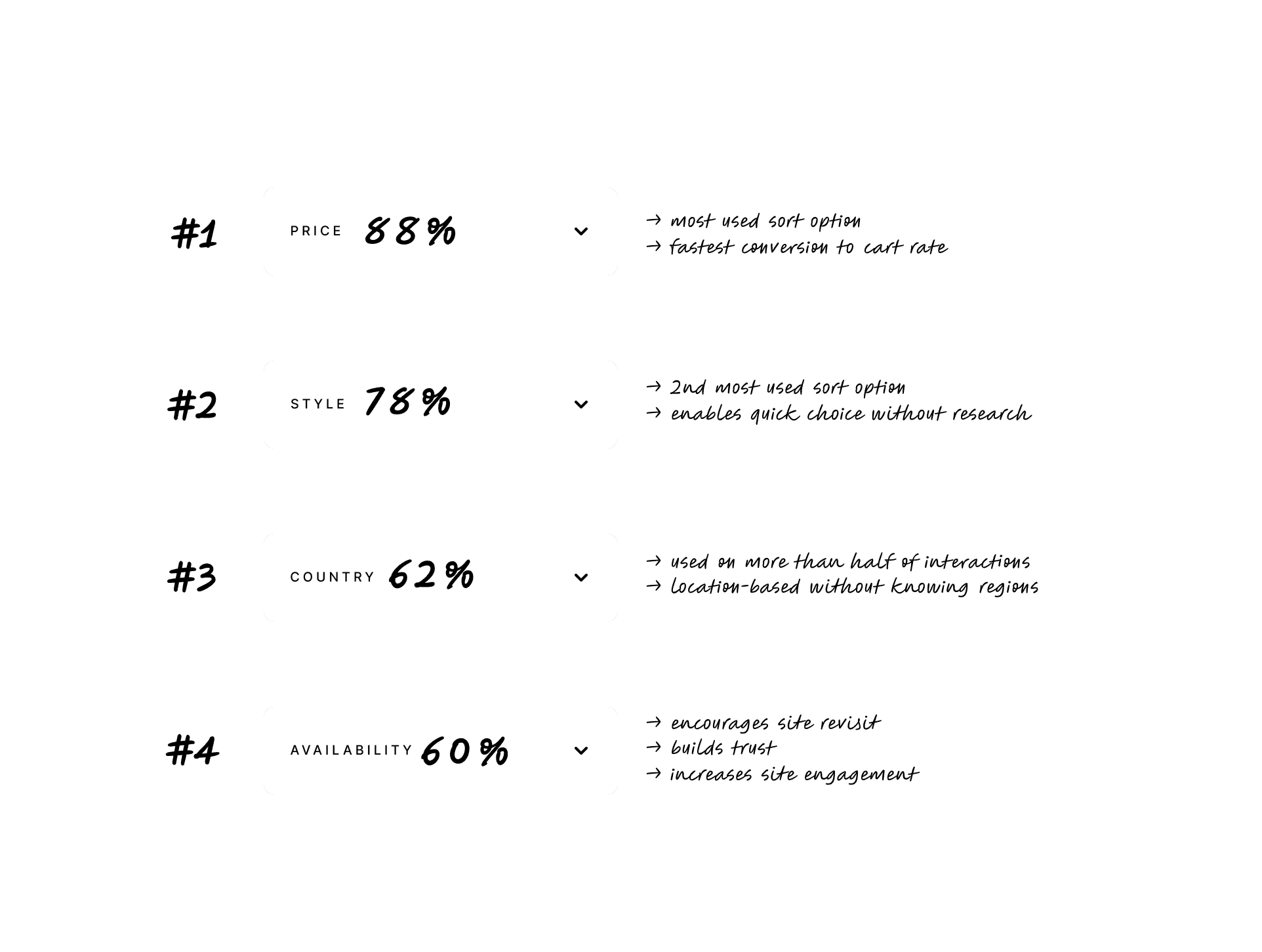
Only 4 filters were used more than 60% of the time, while several other including region and grape varietal were used less than 10% of the time. Additionally, people were clicking false positives around the filters bar and losing their place in the results scroll.
DATA DRIVEN PROBLEM SOLVING
Too many options with unclear navigation caused confusion and cart abandonment.
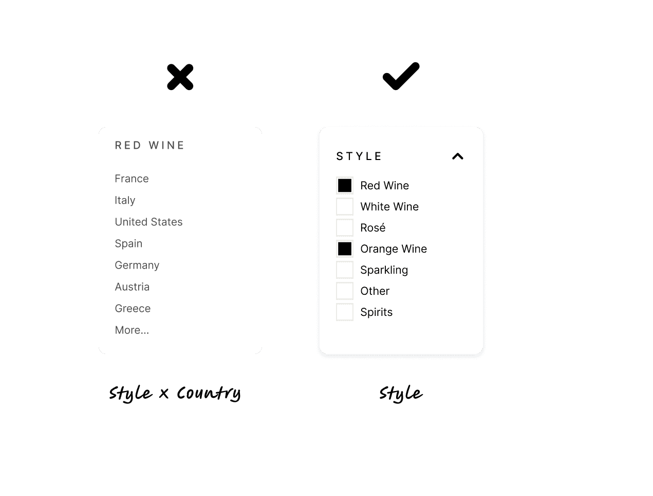
Based on the data, I determined that we needed to reduce and prioritise the amount of filters, and improve accessibility of the chosen filters to increase conversions from clicks into purchases.
Key Problems to Solve:
Speed & efficiency from selection -> cart
Filter quantity & design
Mobile-friendly responsive design
Simplicity & ease of use
Trust & consistency
SOLUTION 1
Improve filter design to speed up input and avoid layout shifts.
Users encountered accidental layout shifts when filter options updated, so they had to orient themselves on the page again, scroll up and down to find where they left off, and then continue with the next input.
SOLUTION 2
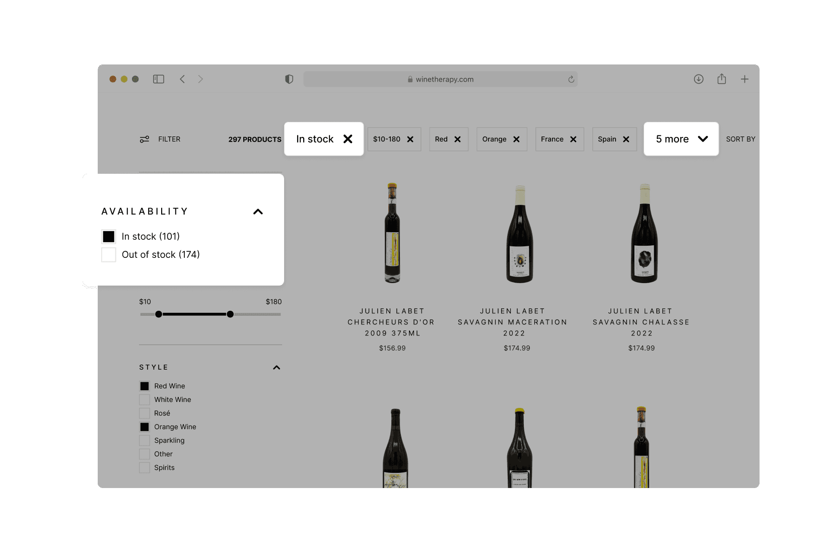
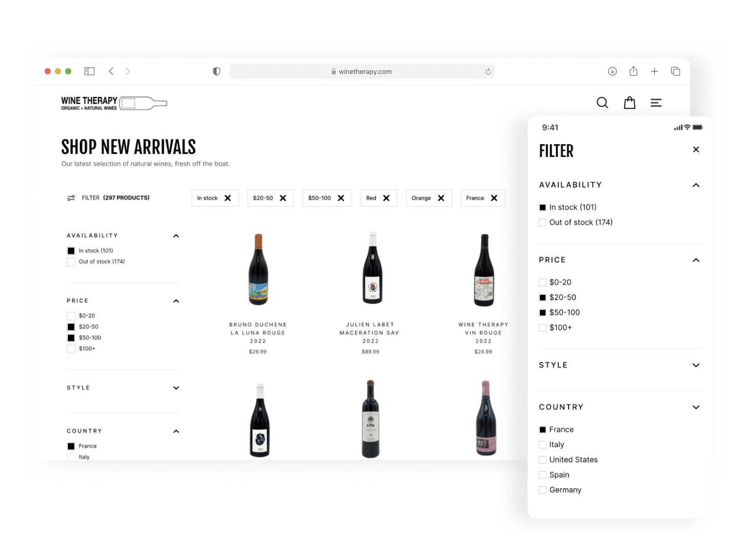
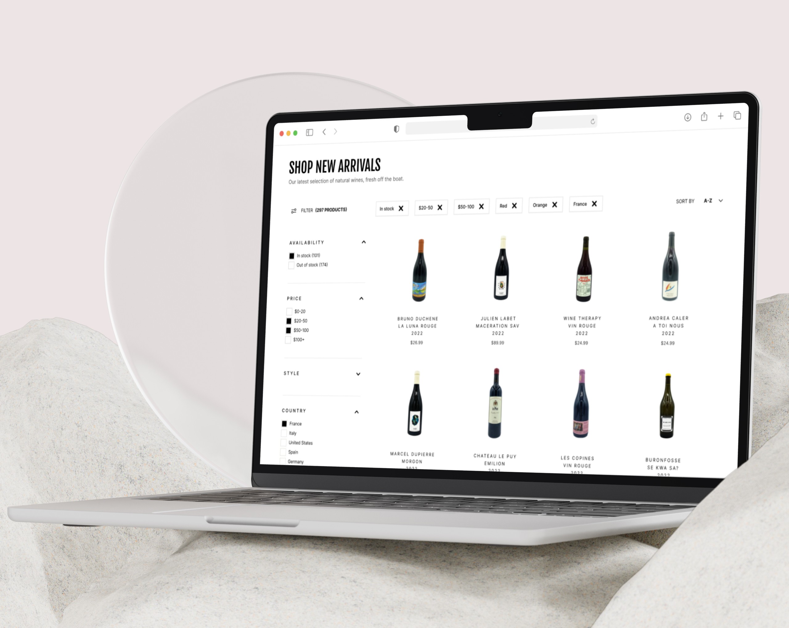
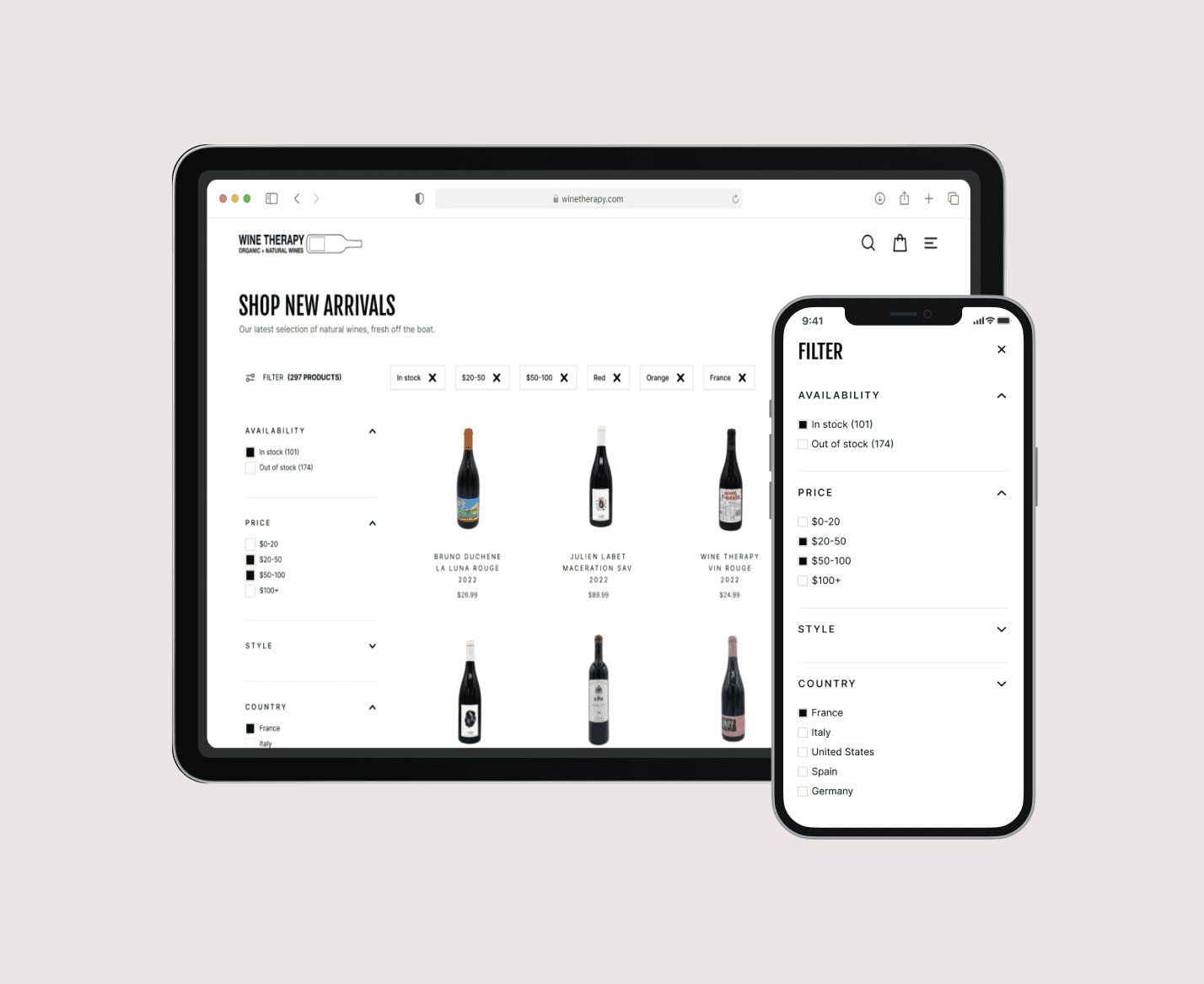
Display applied filters above the results.
User testing data showed that scrolling the side bar to see which filters were active was not enabling a fast selection experience. How could make it easier to move forward with the right filters? By displaying active filters above the product results, I reduced scroll time so users could easily reference which filters were currently active.
SOLUTION 3
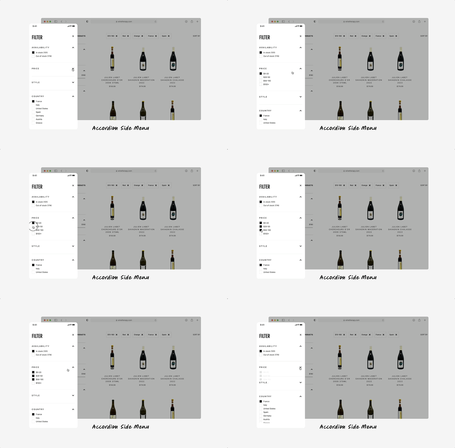
A dynamic, scrollable side panel of asynchronous sorting options, with accordion menu filter types.
Referring back to the heatmaps, I fixed the endless scroll problem by reducing each filter section to collapsable accordions. Their results update in real time, which enables the user to choose filters without losing their place by being auto redirected to the main screen.
Further testing confirmed this was best way to offer control over multiple selections, especially on smaller devices.
↳ No redirecting or separate sub menus
↳ Avoids confusion and mistakes
↳ Faster choice selection
↳ Increases conversion rate from selection to purchase
↳ Mobile-friendly
SOLUTION 4
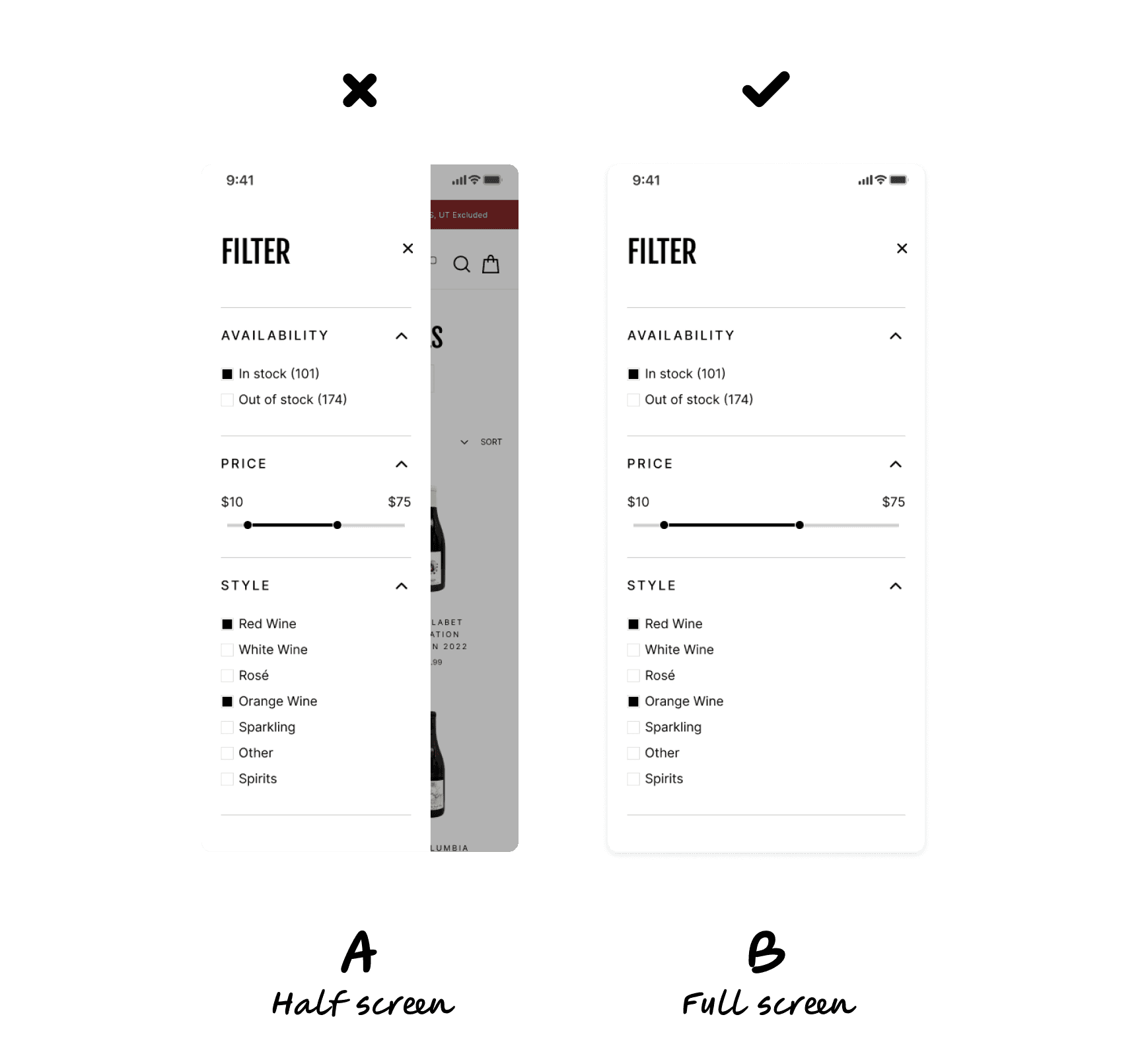
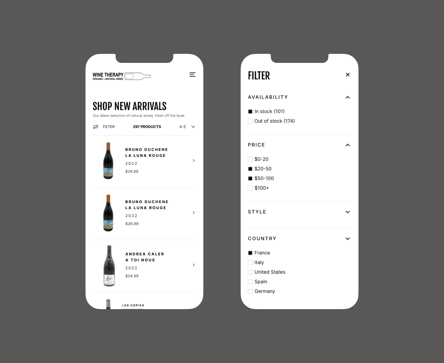
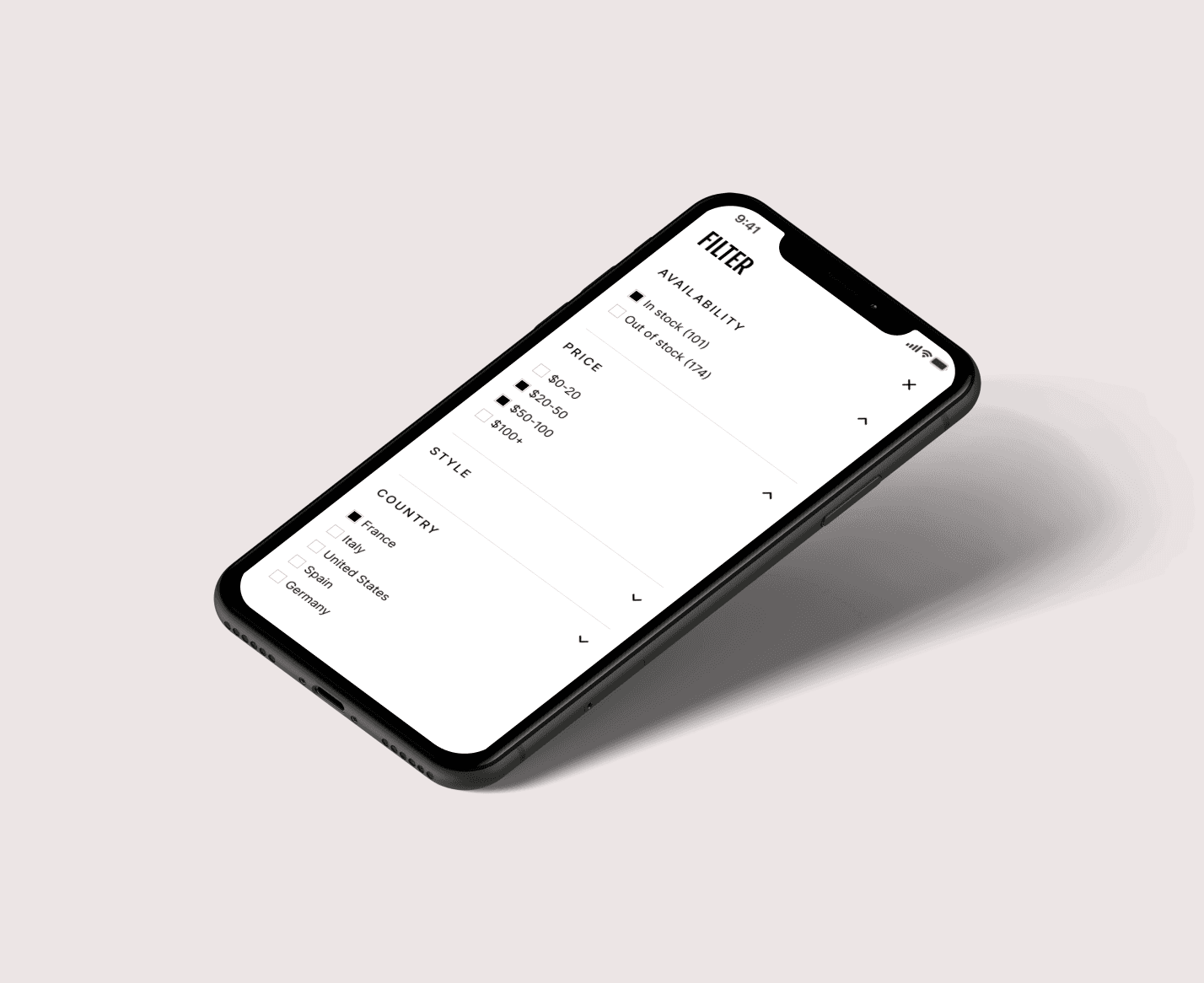
Avoiding split screens on mobile devices.
Reviewing the responsive design for smaller screens, I experimented with a full-screen popup to replace the half screen overlay for filters. It gave more swipe-able area to select options without having to move between separate screens. As anticipated, user testing revealed that accessibility levels increased significantly with the full-screen approach.
A/B TESTING
Making further adjustments based on user preferences and consistency.
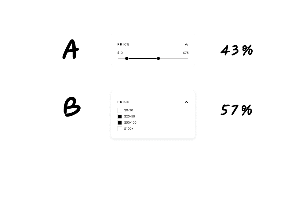
I ran some A/B tests to check whether a slider or check boxes better served users when choosing a price range. Especially on smaller devices, the slider was more slippery and difficult to adjust accurately. However, others enjoyed the feeling of having more control with the manual slider, and felt more engaged with the filters options. But for consistency, and the slight positive margin, I proposed moving forward with checkbox filters.
Impacts
Creating a concise filters menu not only increased user engagement significantly, it boosted online sales and made updates easier for the developer. While this project focused specifically on improving the filter menu, more improvement could be made to the product cards, layout and sizing of text and other brand elements.
